Color Block Interior Design: Bold Geometry Through Paint and Decor
Color block interior design using bold geometric color sections to create visual impact. See how to use this striking technique in any room with AI.
RoomRenovation.AI Team
Updated March 24, 2026
Color block interior design applies one of fashion's most recognizable techniques to the walls, floors, and furnishings of a room: bold sections of unmodulated, high-saturation color in geometric configurations that divide space visually, create drama, and assert a confident design identity. Where most interior color approaches soften and harmonize, color blocking confronts and differentiates. Done right, it is one of the most striking and memorable design moves available to a homeowner; done without thought, it becomes visual chaos.
This guide explains the principles behind successful color blocking in interiors, the techniques for applying it across different scales and room types, and the practical steps that separate a professional result from an experimental mess.
Color Blocking in Interior Design: A Brief Context
Color blocking in interiors draws on multiple visual traditions. The De Stijl movement of the 1920s — Mondrian's primary-color grids, Rietveld's Red and Blue Chair — established the idea that architectural space could be articulated through bold color geometry. Post-war modernist interiors used contrasting color panels to define zones within open plans. Contemporary iterations are less doctrinaire: any combination of bold, clearly differentiated color fields applied in deliberate geometric configurations qualifies.
What distinguishes color blocking from simply painting walls different colors is the intentionality of the geometry, the boldness of the color contrast, and the integration of the color decision with furniture and object placement. Color blocking is a design system, not a paint technique alone.
Scale: From Full Room to Single Object
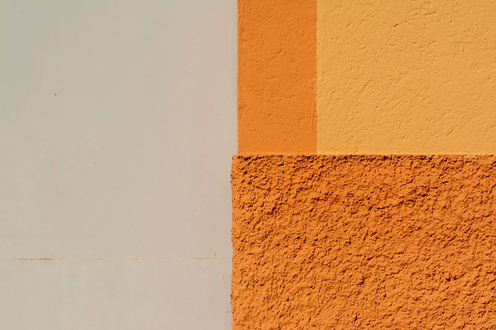
Architectural Color Blocking
The most dramatic scale involves dividing architectural surfaces — walls, ceilings, floors — into distinct color fields. A two-tone wall with an upper half in warm white and a lower half in deep terra cotta, separated by a sharp horizontal line at two-thirds height, redefines the room's proportions. A ceiling painted in a saturated accent color (the "fifth wall") transforms vertical volume into a contained, intimate experience that reads very differently from a white ceiling in the same room.
Color blocking between room zones is particularly effective in open floor plans: painting the kitchen area in a warm deep green while the living area remains cream-white creates visual separation that functions like a wall without closing off space or limiting light. The floor plan remains open while the zones feel distinct.

Furniture and Object Color Blocking
Color blocking can operate at the furniture scale without involving walls at all. A sofa in deep navy flanked by chairs in warm terracotta against a neutral background creates a color block composition through furniture arrangement. A color-blocked rug — geometric sections in two to three bold tones — imports the principle into the room's horizontal plane without any painting.
At the smallest scale, a gallery wall composed of color-blocked framed prints, or a shelf display where objects are grouped by color into distinct sections, demonstrates the principle at low commitment and easy reversibility.
Mid-Scale: The Accent Wall (Done Properly)
The accent wall has been applied so ubiquitously and thoughtlessly that it has acquired a poor reputation — but the concept is sound when executed as genuine color blocking rather than as an arbitrary color difference. An accent wall works as color blocking when:
- The color choice is bold and committed rather than a slightly different neutral
- The wall selected is architecturally appropriate (typically the wall that faces you as you enter, or the wall that a key furniture piece anchors against)
- The color is repeated in at least one other element in the room — a cushion, a lamp, a ceramic object — so it reads as design decision rather than accident
- The geometry of the block is considered: a full floor-to-ceiling block reads differently from a block that stops at a chair rail or extends only to the window casing
Choosing Colors That Block Successfully
High Contrast vs. Analogous Blocking
Color blocking works with both high-contrast and analogous (related) color pairings, but produces different effects:
High-contrast blocking — warm against cool, light against dark, complementary colors opposite each other on the color wheel — produces maximum visual impact and energy. Navy with terracotta; sage green with cherry red; cobalt with warm white. These combinations charge a room with visual tension and are appropriate for spaces where energy and activation are desired: studios, dining rooms, entry halls, active living spaces.
Analogous blocking — colors adjacent on the color wheel, stepping through a range — produces a more sophisticated, tonal effect. Sage green moving to deep hunter, terracotta stepping from pale peach to deep rust, blues from sky to midnight. These combinations still clearly read as color blocking but are easier to live with over time and suit spaces where daily presence requires more visual ease: primary bedrooms, home offices, family rooms.
The Neutral Anchor
Most successful color blocking compositions include at least one significant neutral element that gives the eye a resting point between bold sections. This can be a floor in natural wood or stone, a ceiling that remains white, a large sofa in cream or warm gray, or a significant expanse of natural-material textile (linen curtains, a sisal rug). The neutral is not timidity — it is compositional intelligence, the equivalent of silence in music.
How Many Colors
Two to three colors is the almost universal guideline for interior color blocking. A two-color block is clean and decisive; a three-color block can introduce dynamic tension if the three are carefully related. Four or more begins to fragment the composition unless the room is very large and the palette is particularly coherent. The temptation to add another color "for interest" usually produces confusion rather than complexity.
Executing Color Blocks: Practical Guidance
The Painter's Tape Test
Before committing a geometric color block to paint, map the proposed geometry with painter's tape on the wall and live with it for several days. The proportions that look right on a sketch or a reference image often require adjustment in a specific room's light and scale. Move the tape up or down, expand or contract the block, until the division reads as intended from the room's natural viewing position.
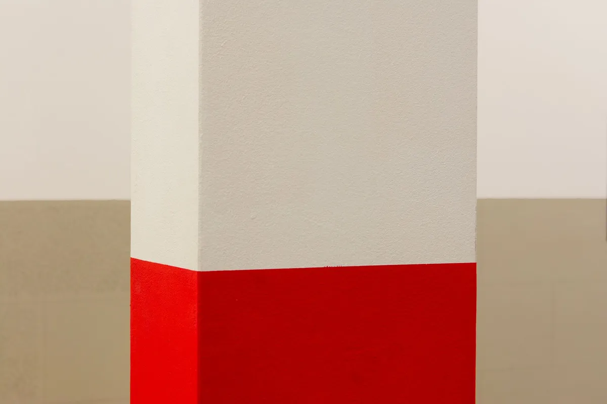
Consistent Sheens Within a Block
Using the same paint sheen for both colors in a two-tone block creates a seamless transition at the boundary line. Mixing sheens (flat for one color, semi-gloss for another) can work intentionally — using a higher sheen for the upper section reads as deliberate contrast — but an accidental sheen difference is immediately apparent and undermines the precision the look requires.
Extending Blocks Past Corners
A color block that stops at a corner can sometimes look like an incomplete wall. Consider whether the block should wrap onto the adjacent wall, turn the corner, and stop at a logical architectural break. This wrapping treatment reads as more architecturally integrated and intentional than a block that ends at the corner and leaves adjacent walls in a different color.
Room Applications
Living Room
The living room benefits from bold color decisions because it is a space of gathering and visual engagement rather than sleep or concentrated work. A two-tone wall treatment behind the main sofa — upper portion in warm white, lower in deep sage green with a precise horizontal demarcation — creates architectural depth and a distinctive backdrop. The sofa and key furniture operate against both tones, while the composition as a whole reads as designed rather than decorated.
Dining Room
Dining rooms are often the most appropriate space for the boldest color decisions: they are occupied in social situations, typically in evening light, and are small enough that a strong color commitment creates intimacy rather than overwhelm. Deep jewel tones — cobalt, burgundy, forest green, midnight blue — blocking one full wall or wrapping the entire room (a "color drenching" technique related to color blocking) suit dining rooms particularly well.
Explore what a dramatic dining room color block would look like in your space with RoomRenovation.AI's visualization tool — the difference between what you imagine and what actually reads well in your specific room's light is significant enough to justify testing before painting.
Bedroom
Bedrooms suit more restrained color blocking: a single bold headboard wall in a deep warm tone (terracotta, sage, dusty mauve) against white or cream on remaining walls. The horizontal plane of the bed anchors the composition, and the color creates a cocooning effect behind the sleeping position that many people find particularly comfortable.

Seeing Color Blocking in Your Room Before Painting
Color choices are notoriously hard to evaluate from paint chips and reference images alone — a tone that looks perfect on a small swatch can read as overwhelming at wall scale, or the proportion of the block that appears right in a larger reference room doesn't translate to your specific room's dimensions. RoomRenovation.AI renders your actual room with the proposed color block treatment, letting you evaluate the complete composition — color, proportion, geometry — before buying a drop of paint.
See the examples gallery for real rooms transformed with color blocking. For complementary design directions, explore modern minimalist which shares color blocking's appreciation for bold, deliberate visual decisions. Render pricing starts at a few dollars — less than a single sample pot of specialty paint.
FAQ
How precise does the line between color blocks need to be? For hard-edge blocking, painter's tape and careful cutting in produces a crisp line that reads as intentional. A slightly soft or uneven edge reads as error; a deliberately wide, blended transition reads as a different (and also valid) technique called an ombre or gradient block. Commit fully to one approach.
Can color blocking work in a rented space where I cannot paint? Yes. Removable wallpaper panels in color-blocked sections, large-scale color-blocked rugs, furniture in deliberate color contrast, and gallery walls or large prints can all execute the principle without wall paint.
Is color blocking suitable for small rooms? With careful color selection, yes. Using lighter and cooler tones for the larger block section (which reads as receding) and a bolder or warmer accent for the smaller section preserves spatial openness while introducing the aesthetic. Dark blocking on all surfaces in a small room is more challenging.
How do I choose the right height for a horizontal color divide on a wall? The division at two-thirds height (measuring from the floor) suits most rooms and aligns with chair rail conventions. For a low, dramatic effect, a one-third height division (like an extended wainscoting) works well with bold lower-portion colors. Halving the wall tends to look awkward and undecided.
Does color blocking go out of style quickly? Bold color choices cycle in and out of mainstream fashionability, but color as an architectural tool has been in continuous use across centuries of design. The risk isn't dating — it's executing a trend interpretation rather than a genuine design decision. Color blocks made from personal conviction rather than trend-following tend to age better.