How Paint Colors Affect Room Perception: Use AI to Test Before Buying
Paint color psychology and how AI visualization helps you test wall colors before painting. See how color changes affect mood, space, and light in your room.
RoomRenovation.AI Team
Updated March 24, 2026

Paint color affects room perception in ways that go far beyond aesthetics — the same room can feel larger or smaller, warmer or cooler, calmer or more energizing depending entirely on the color on its walls. Understanding the psychology behind these effects, and using AI visualization to test color choices before buying a single can of paint, can save you from the expensive and time-consuming mistake of painting a room a color that doesn't deliver what you expected.
How Color Actually Changes a Room
The relationship between paint color and room perception operates through several distinct mechanisms:
- Spatial expansion and compression: Light colors reflect more light, making walls appear to recede and rooms feel larger. Dark colors absorb light, drawing walls inward and creating a sense of enclosure or intimacy.
- Thermal perception: Warm colors (red, orange, yellow, warm white) genuinely make spaces feel physically warmer. Cool colors (blue, blue-gray, green) feel cooler. This isn't metaphorical — research consistently shows that people estimate temperatures differently in warm- vs. cool-colored rooms.
- Ceiling height: A ceiling painted the same color as the walls visually raises it; a ceiling darker than the walls lowers it. A bright white ceiling against colored walls creates a sense of height regardless of actual dimensions.
- Light interaction: Paint color is inseparable from the light in your specific room. A cool gray that looks balanced in a north-facing room with blue-toned daylight will read as blue-purple in a south-facing room with warm afternoon light. This variability is why testing in your actual space — or using AI that accounts for your room's light — is so important.
Color Psychology Room by Room
Living Rooms: Social and Inviting
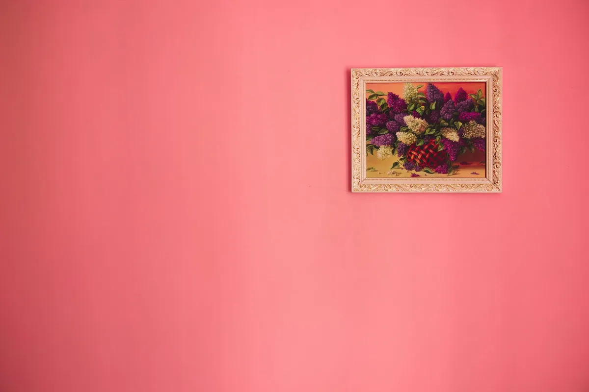
Living rooms benefit from colors that invite conversation and feel welcoming. Warm whites (Benjamin Moore White Dove, Sherwin-Williams Alabaster) have dominated for the last decade because they're universally flattering, reflect light well, and provide a neutral base for any furniture palette. Warm neutrals — greige, warm taupe, soft terracotta — add character without committing to a bold direction.
Accent walls in deep colors (navy, forest green, burgundy) work well in living rooms because the room is typically large enough to absorb the impact. A deep green accent wall behind a sofa creates a jewel-box quality that reads sophisticated rather than overwhelming. Explore living room design ideas for more approaches.
Kitchens: Clean and Energizing
Kitchens have traditionally defaulted to white because it reads as clean and bright. Contemporary kitchen design has moved decisively toward more character: sage green, navy blue, warm black, and earthy clay are now common cabinet colors. Wall color in kitchens is often secondary to cabinet color but should complement it — warm white walls with warm-toned cabinets; cool white or gray walls with cooler cabinet tones.
Yellow has long been recommended for kitchens based on its energy-boosting psychological effects, but the specific tone matters enormously. A warm, muted yellow feels sunny and pleasant; a high-chroma lemon yellow reads as harsh under artificial kitchen lighting.
Bedrooms: Calm and Restorative
Bedroom color psychology consistently points toward cool, muted tones for sleep quality. Soft blue (scientifically associated with lower heart rate and blood pressure), lavender-gray, soft sage green, and warm neutral tones all create the restful atmosphere bedrooms require. Avoid high-chroma or warm energizing colors like orange, bright red, or saturated yellow in bedrooms.
The trend toward "moody" bedrooms — deep charcoal, dark navy, forest green — works well psychologically because the enclosure created by dark colors on all four walls (including the ceiling) can feel womb-like and deeply restful rather than oppressive, especially in bedrooms where the goal is darkness and calm.
Bathrooms: Fresh and Spa-Like
Small bathrooms present the most acute color-and-perception challenge. A dark color that works dramatically in a large bathroom will feel suffocating in a small one. For small bathrooms, light-reflective neutrals — soft white, pale gray, soft sage — maintain openness. See our bathroom renovation guide for design and cost context.
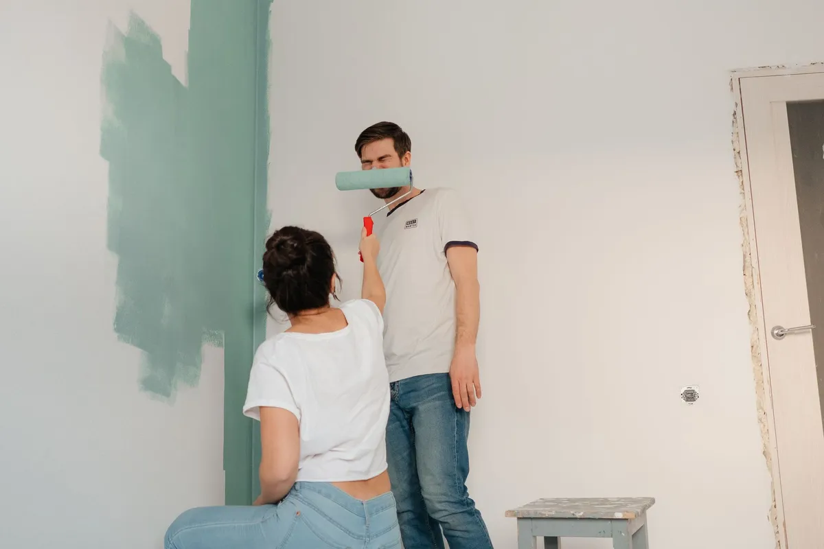
The Problem With Choosing Colors From Swatches
Paint swatch selection is one of the most unreliable processes in home renovation. The reasons are structural:
Small swatches are evaluated under store lighting (typically cool fluorescent), not in your specific room's light. The metamerism problem — colors shifting dramatically under different light sources — means the swatch color and the on-wall color can look completely different. Even larger sample patches (2×2 feet) can misrepresent how a color will read across a full wall because small samples don't capture the full tonal shift that happens when a color occupies an entire surface.
The traditional remedy — buying multiple sample cans and painting test patches — costs $30–$100 per room and produces results that are still incomplete, because test patches on a single wall don't show how the color interacts with light from multiple angles throughout the day.
How AI Visualization Changes the Color Testing Process
AI room visualization tools have made paint color testing dramatically more reliable and far less expensive. Upload a photo of your room to RoomRenovation.ai, select a style that incorporates the wall color you're considering, and see a photorealistic render of your actual room with that color on the walls — accounting for your room's specific light, existing furniture, and architectural proportions.
The AI processes the light conditions in your uploaded photo and simulates how different colors would interact with that specific light. A north-facing room with cool natural light will show colors differently than a south-facing room — the same variation you'd see in reality. This makes AI-rendered color testing far more predictive than swatch comparison.
The workflow: generate 3–5 color direction renders before buying any sample cans, narrow to your top two choices, then buy one sample can for each and paint small test patches to confirm. This approach reduces paint sample spending by 60–70% and dramatically reduces the risk of committing to a color that doesn't work in your specific space.
Try it with a free room render — upload your room photo and see it transformed. For ongoing color testing across multiple rooms, see our pricing plans starting at just a few dollars per render.
Specific Color Effects Worth Understanding
White Is Never Simple
There are hundreds of "whites" available, and their undertones — pink, yellow, blue, green — are invisible in isolation but glaringly apparent once on a wall. Warm whites with yellow or pink undertones (Sherwin-Williams Alabaster, Benjamin Moore White Dove) pair well with wood floors and warm materials. Cool whites with blue or green undertones (Chantilly Lace, Super White) read crisper and work better with cool-toned materials and contemporary chrome or stainless finishes.
Greens in 2026
Green has become the single most impactful color trend in interior design and shows no sign of retreating in 2026. The most successful greens are complex — slightly gray, slightly olive, or slightly blue rather than saturated elementary-school green. Benjamin Moore October Mist, Sherwin-Williams Retreat, and Farrow & Ball Mizzle are examples of the nuanced, livable greens that have become design staples.
Black as a Paint Color
Painting walls (or an entire room including ceiling) matte black or very dark charcoal is one of the most dramatic and counterintuitively successful approaches in contemporary interior design. Dark rooms often feel larger rather than smaller because the boundaries dissolve in low light. Bedrooms and dining rooms are particularly successful candidates for very dark color applications.
Practical Color Testing Workflow
- Identify your room's light direction (north, south, east, west) and note whether it receives more morning or afternoon light
- Upload a photo of your room to an AI visualization tool and generate renders in 3–5 color directions
- Narrow to 2 finalists and view them at different times of day in the render (morning vs. evening feels)
- Buy one sample can of each finalist and paint 12×12 inch patches on different walls, including one near the window
- Observe the patches at morning, midday, late afternoon, and evening under artificial light before committing
FAQ
Does paint finish (matte vs. eggshell vs. semi-gloss) affect color perception? Yes, significantly. Matte finishes absorb light and make colors appear deeper and richer. Semi-gloss and gloss finishes reflect light, which makes colors appear lighter and more vibrant. For most walls, eggshell or satin strikes the balance between cleanability and true color representation.
Will the color I see on my screen match what AI renders show? Screen calibration varies, so the exact color won't be pixel-perfect. But the relative effect — lighter vs. darker, warmer vs. cooler, more or less dramatic — is accurately represented by AI renders. Use them for directional decisions, then validate with physical samples.
Can one wall color make a small room feel significantly larger? Light, cool colors (white, pale gray, soft sage) do create measurable perceptual expansion in small rooms. In a very small room (under 120 sq ft), the difference between the right and wrong color can make the room feel 15–20% more spacious perceptually.
How does existing furniture color affect my wall color choice? Significantly. Warm wood floors and warm-toned furniture limit your wall color options to warm tones (or a careful cool complement). Cool-toned rooms with gray floors and chrome fixtures struggle with warm whites and work better with cool or neutral palettes. AI renders account for your existing furniture in the color visualization.